Formula One Energy Drink
Beyond the Track
FMCG | BRAND REFRESH & GO-TO-MARKET
When Formula One Energy Drink approached me, they had a powerful name but a cluttered visual identity. The brand was trapped in racing clichés: complex logos, crowded typography, and literal car imagery. I led a comprehensive brand refresh to pivot the brand from a racing drink to a high-performance lifestyle icon ready for regional scale.
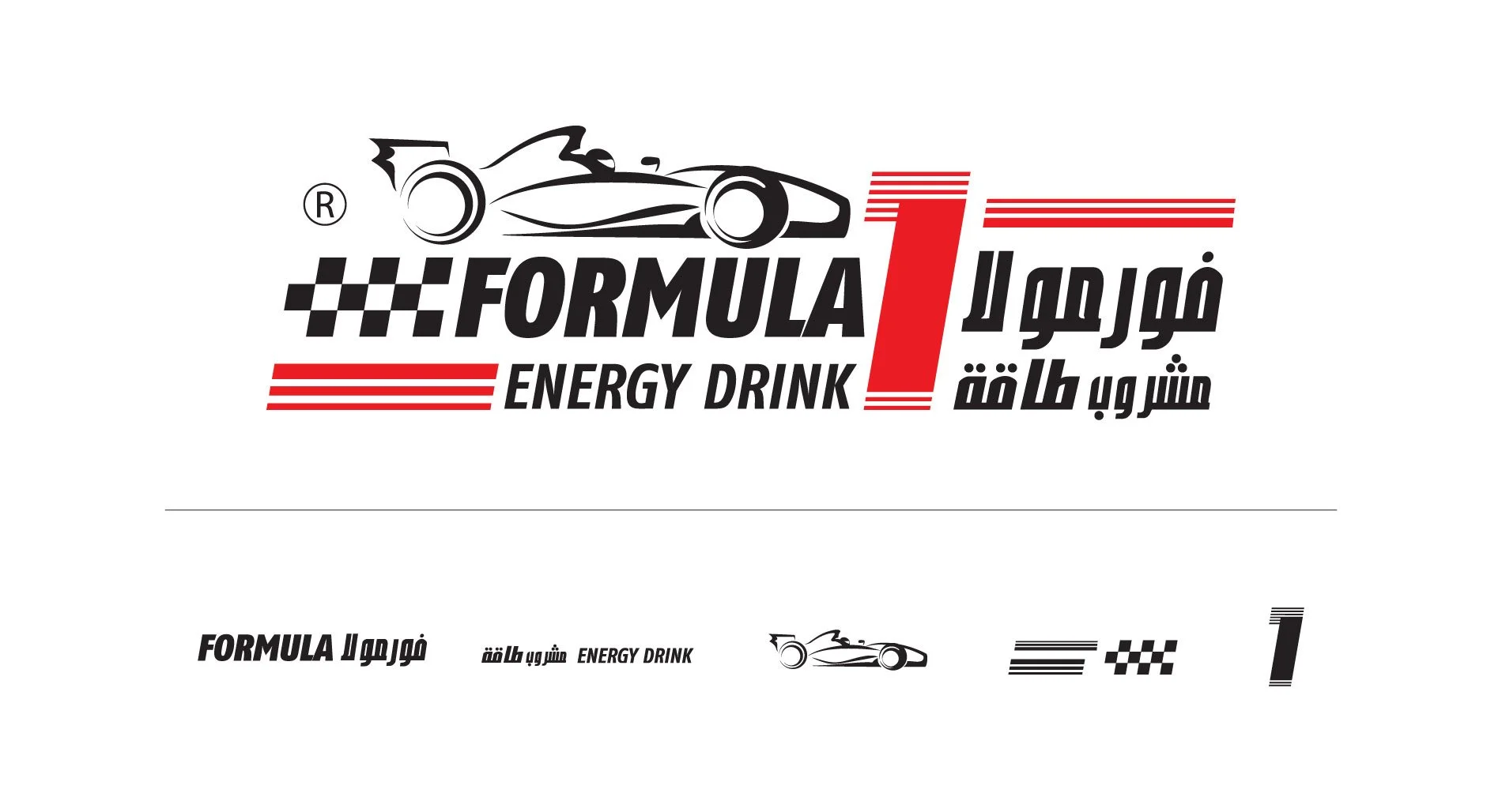
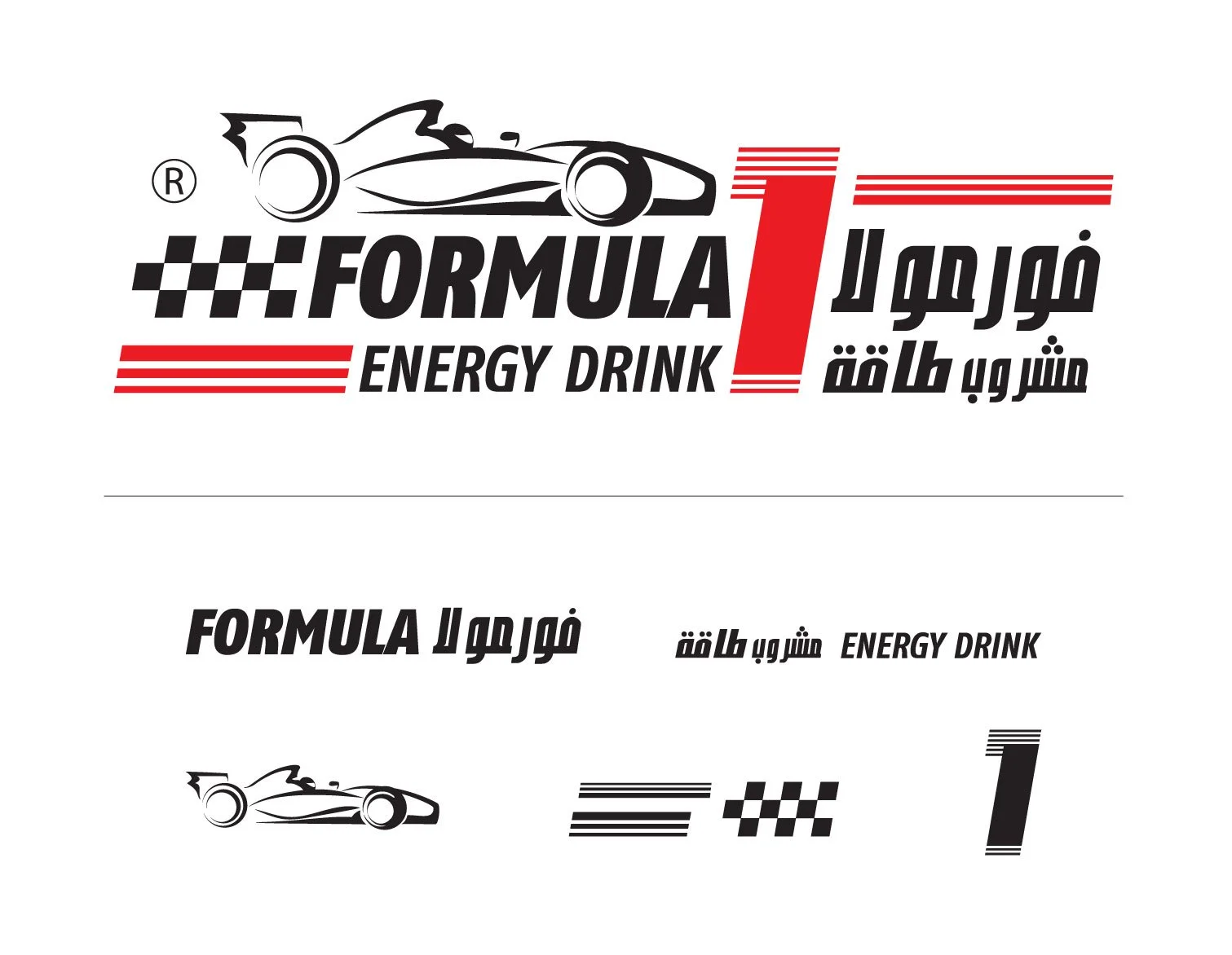
01 | The Challenge (The Brand Audit)
The original identity suffered from visual noise. Multiple languages and redundant racing symbols made the brand difficult to scale in a saturated FMCG market.
The challenge was to strip away the literal racing references and uncover the core essence of the name: Momentum.
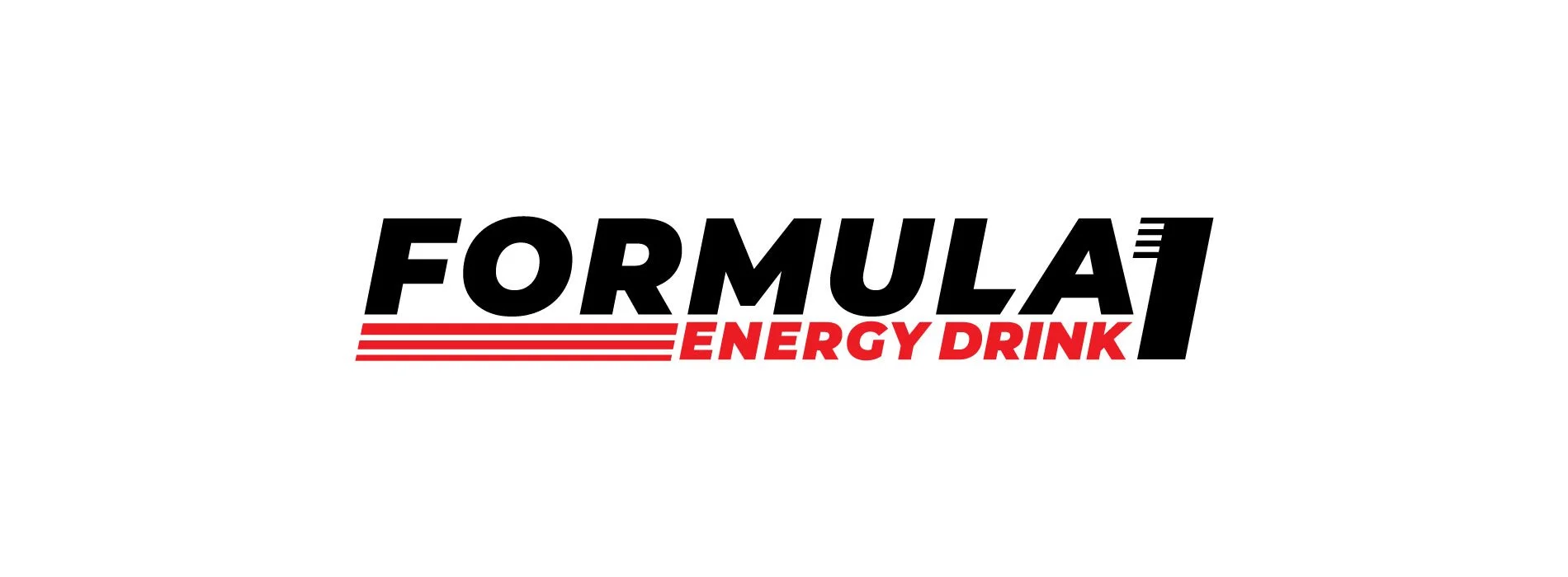
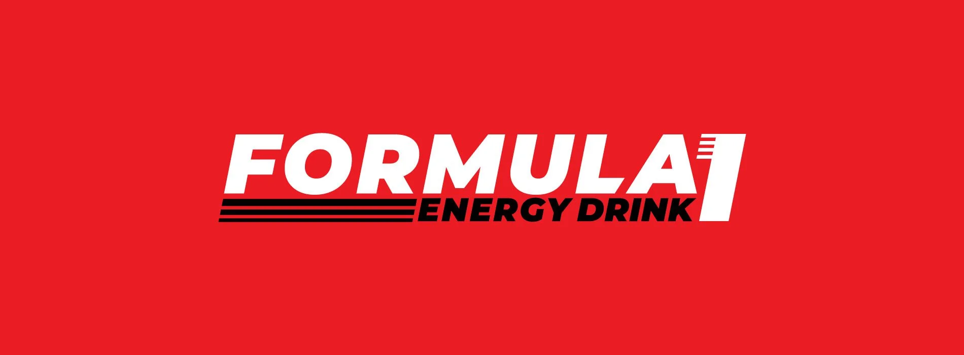
02 | The Approach (Deconstruction & Clarity)
We began by deconstructing the identity. By removing the literal race car and excess typography, we created a sharpened, modern mark focused on confidence and speed. This transformation turned a niche motorsport logo into a versatile brand mark that commands attention through simplicity.

03 | Packaging Design (The "White Queen")

From there, we designed the primary product packaging (250ml can), creating a bold and minimal look that stood out on shelves. The final design, later referred to by the client as “The White Queen,” balanced premium aesthetics with strong visual impact.

04 | Strategic Direction (The Market Pivot)
The most critical shift was moving away from traditional motorsport imagery. Instead, I repositioned the brand around a more universal human driver: Relentless Momentum.
We moved from "racing" to the idea of uninterrupted flow, targeting creators, late-night strivers, and visionaries who refuse to stop.

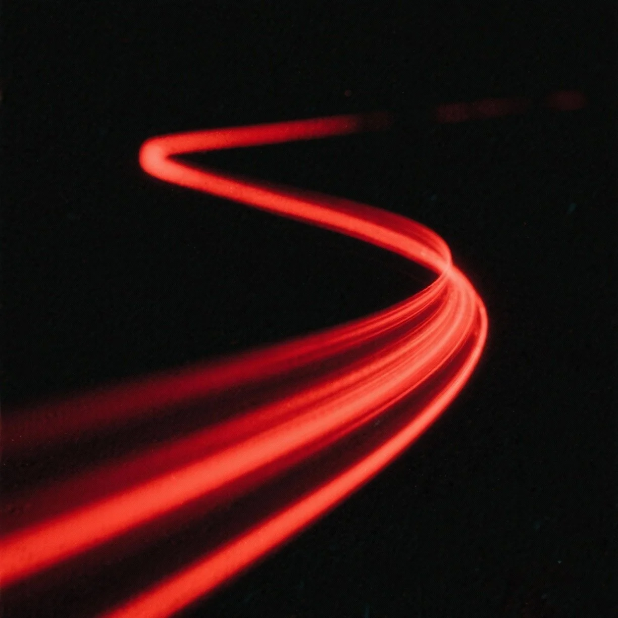
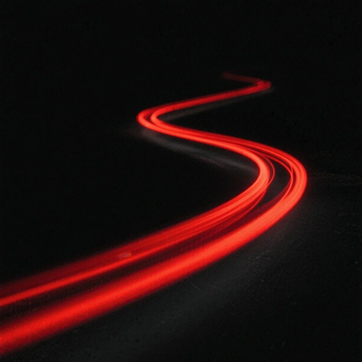
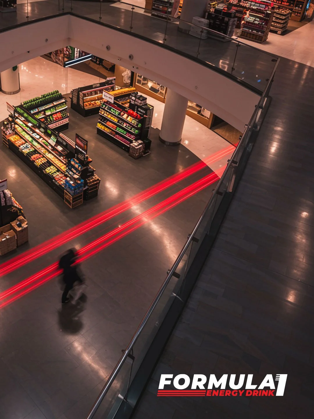
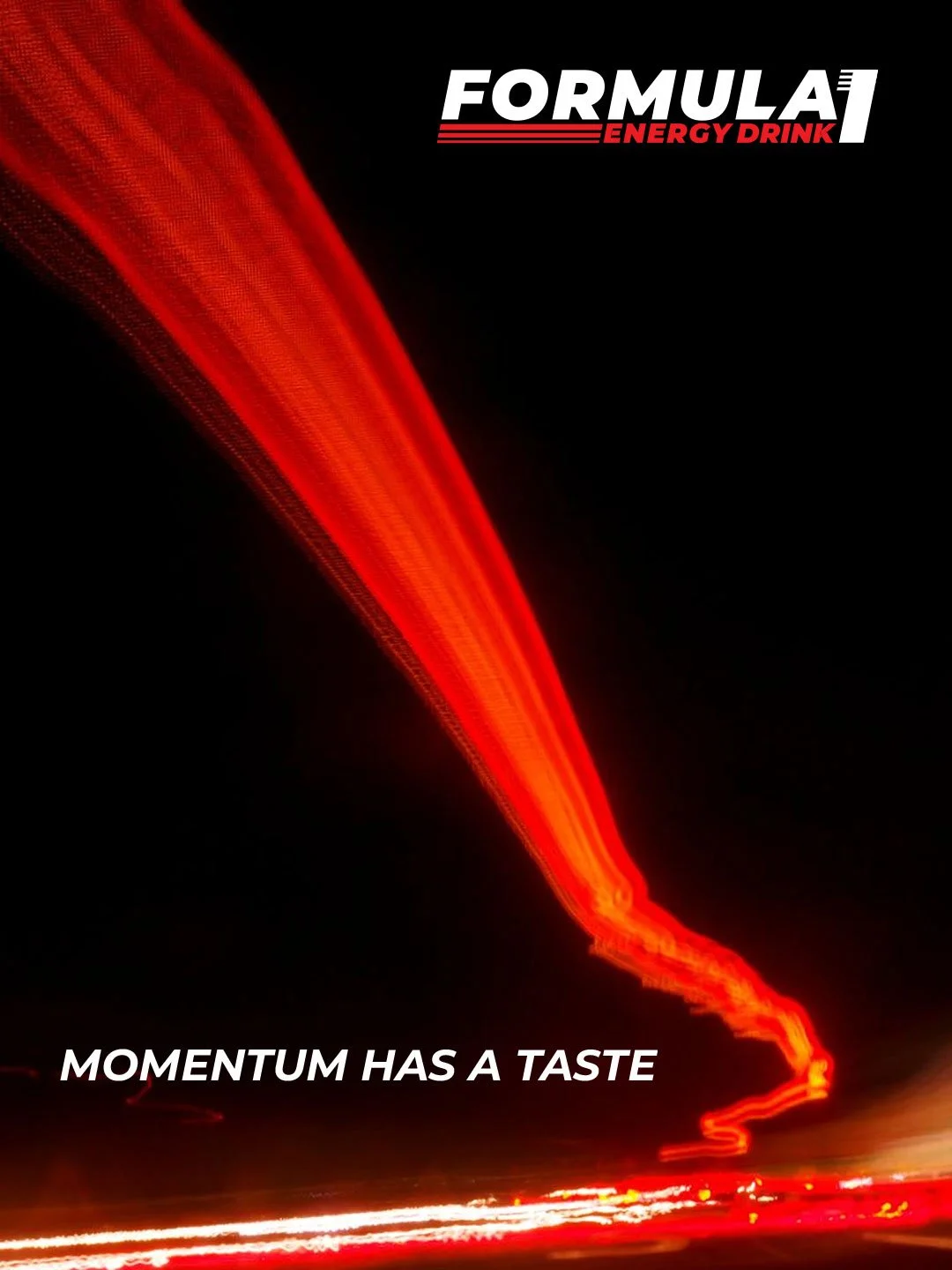
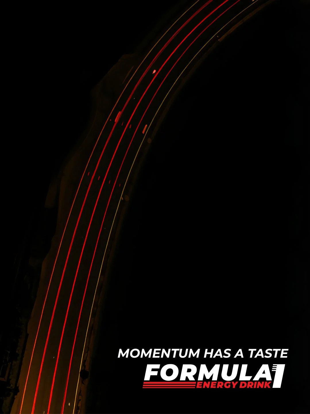
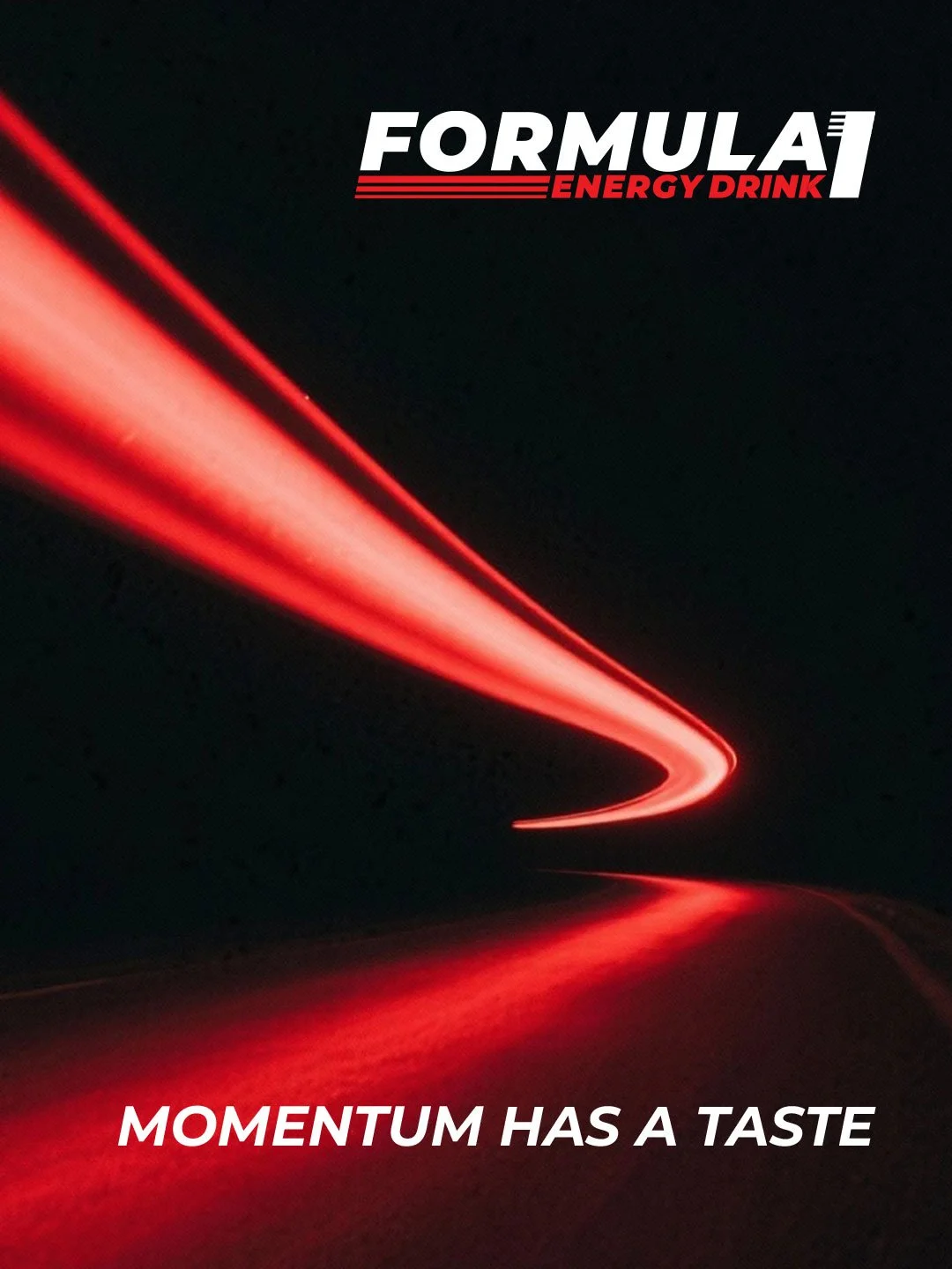
05 | Art Direction (The Signature Motif)
The defining visual element of the campaign is the long-exposure red tail light. This signature stroke captures motion and focus in a single graphic gesture.
By using this motif as a unifying thread, we turned every campaign image into a dynamic representation of drive, giving the brand a distinct visual language.

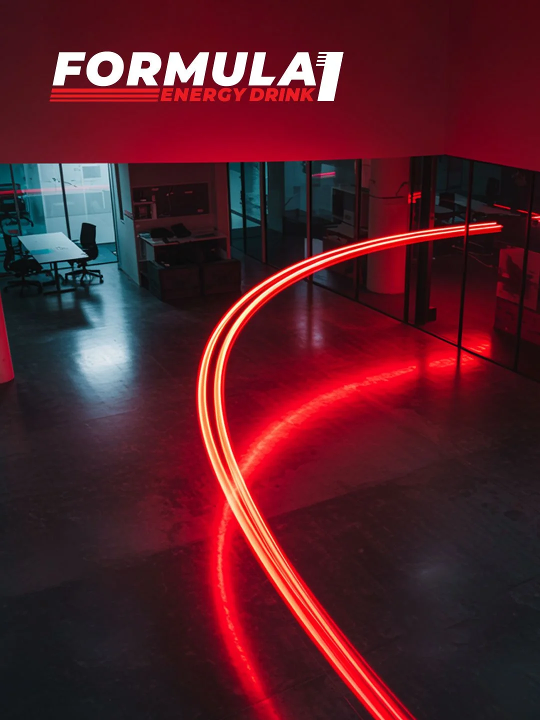
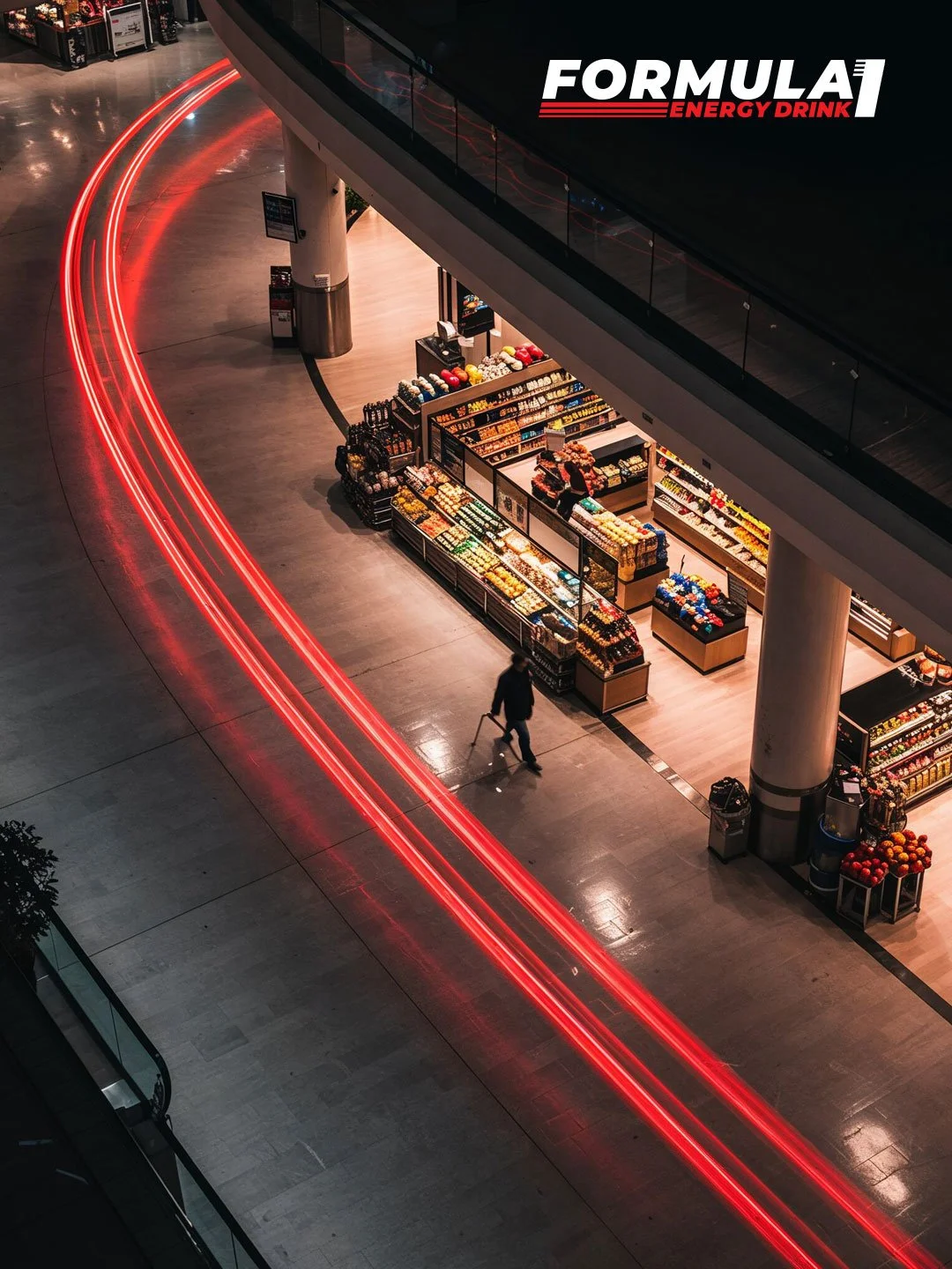
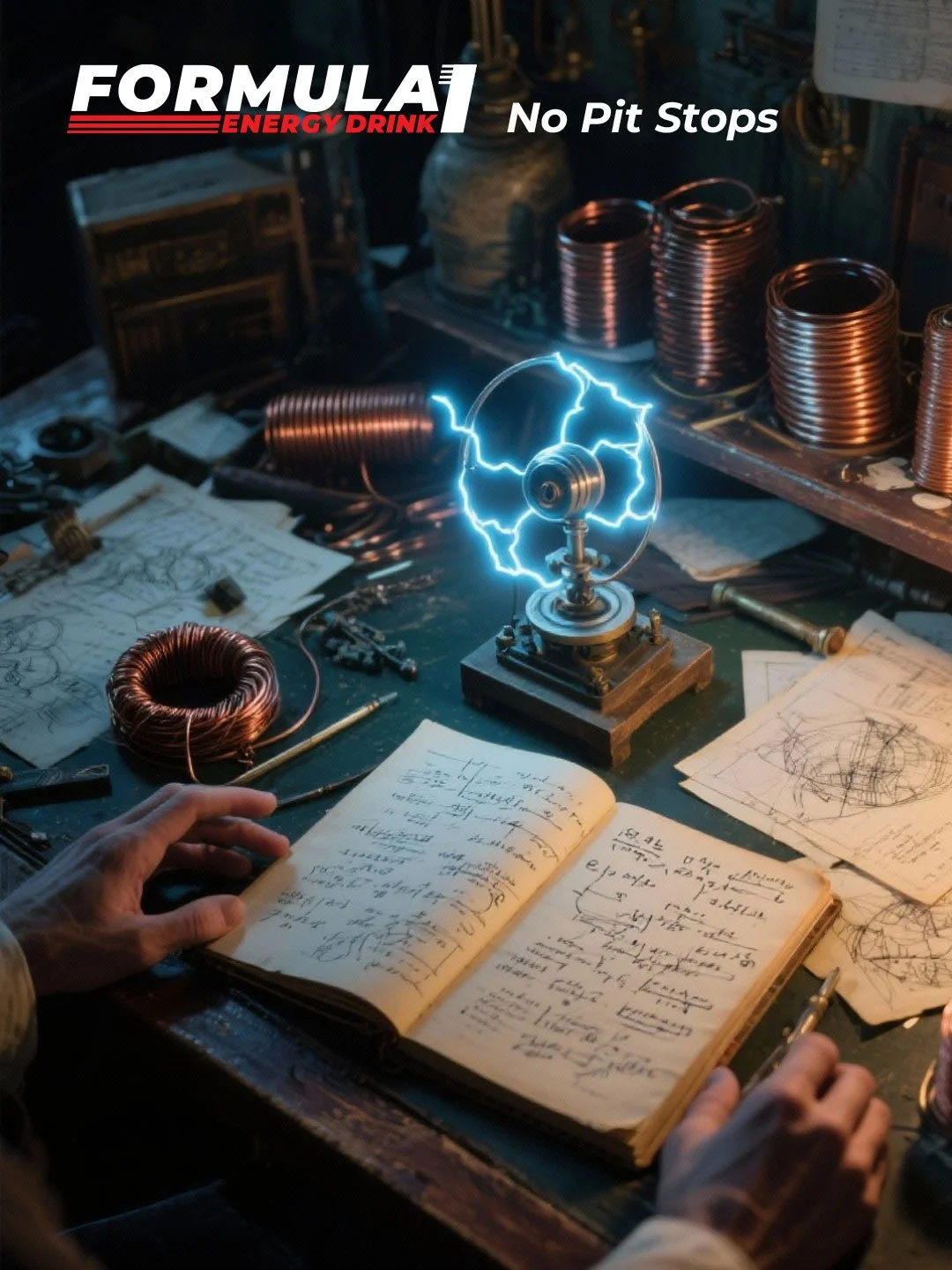
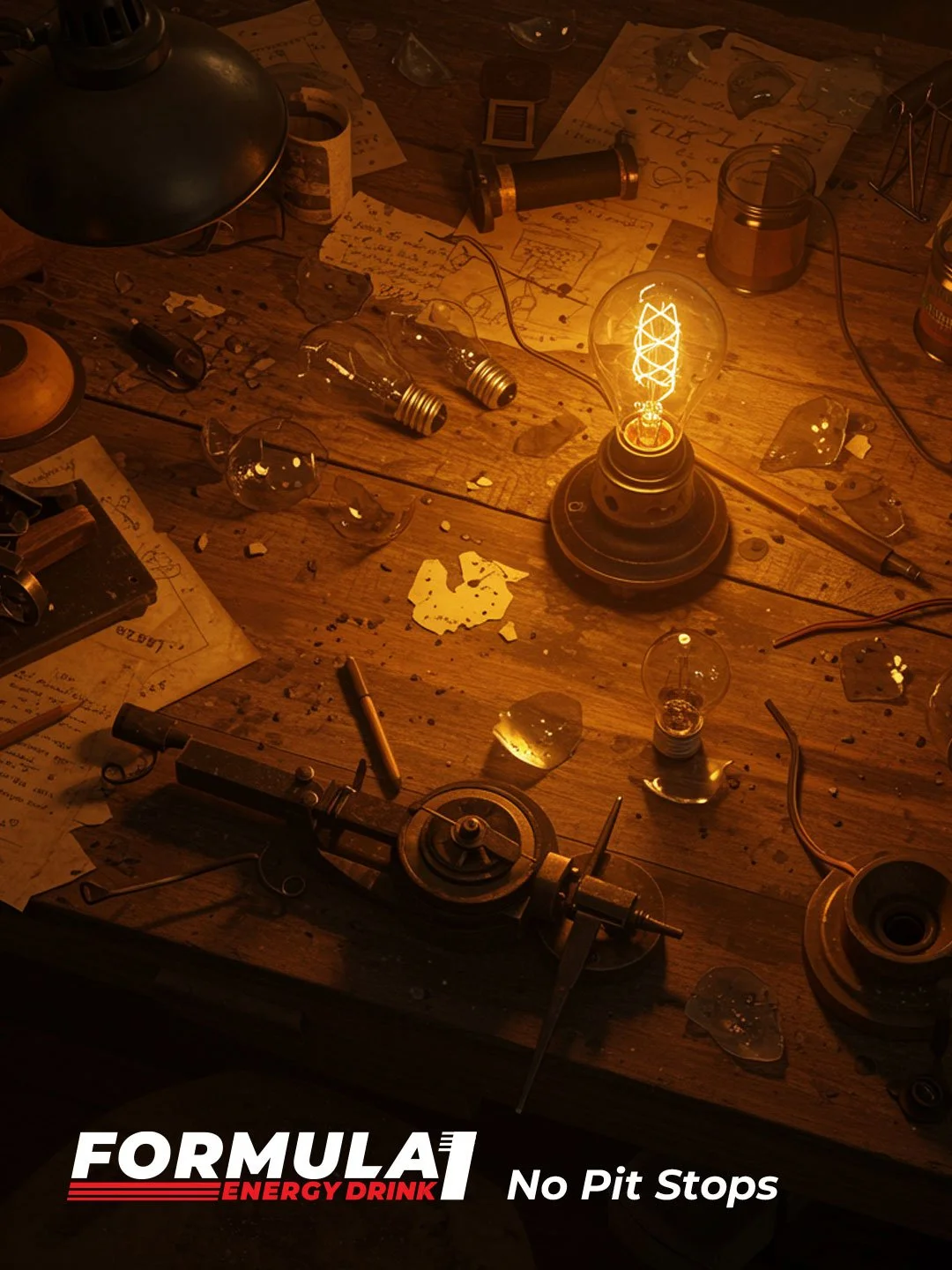
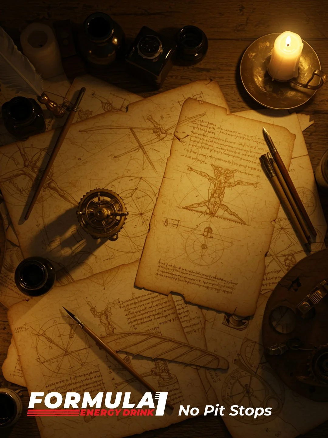
06 | The Extended Campaign (No Pit Stops)
To reinforce the new philosophy, I developed the "No Pit Stops" campaign. This series focused on iconic figures known for their persistence. Through minimal, top-down compositions of their workspaces, we highlighted that greatness is achieved through uninterrupted momentum.
This campaign moved the brand from "Energy Drink" to "A Partner in Success," solidifying its place in the lifestyle of the modern high-achiever.