Dar Al Riyadh
GOVERNMENT & CORPORATE | DESIGN DIRECTION
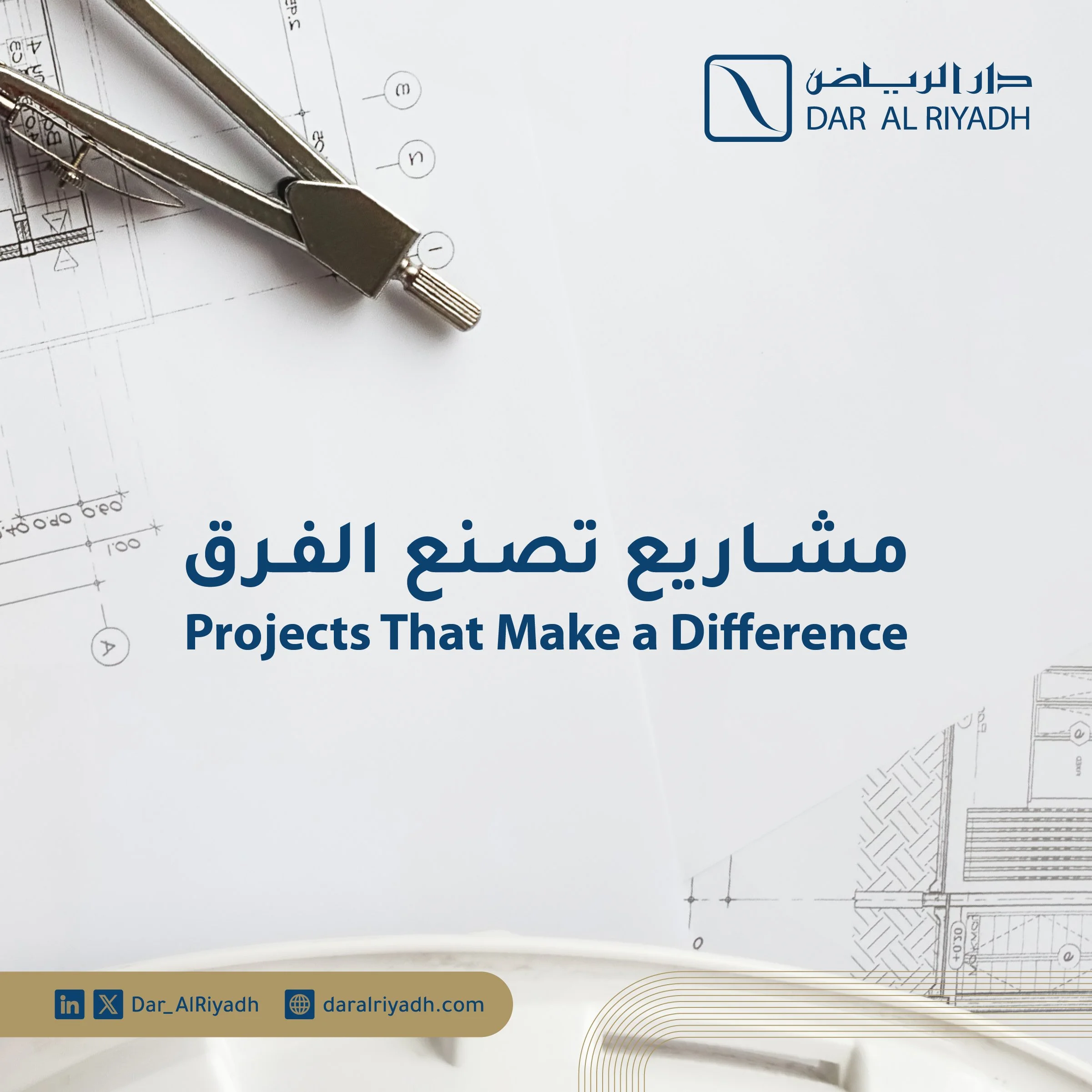
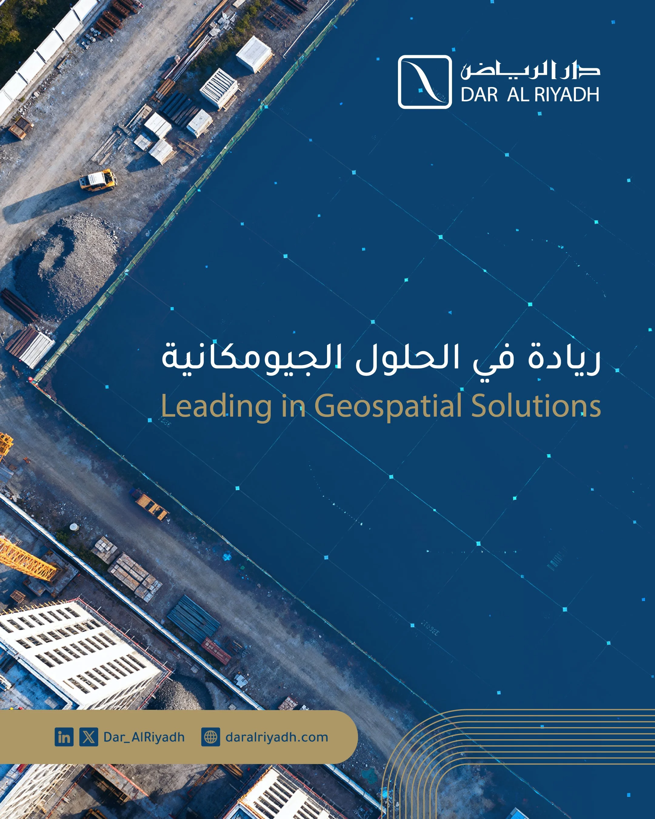
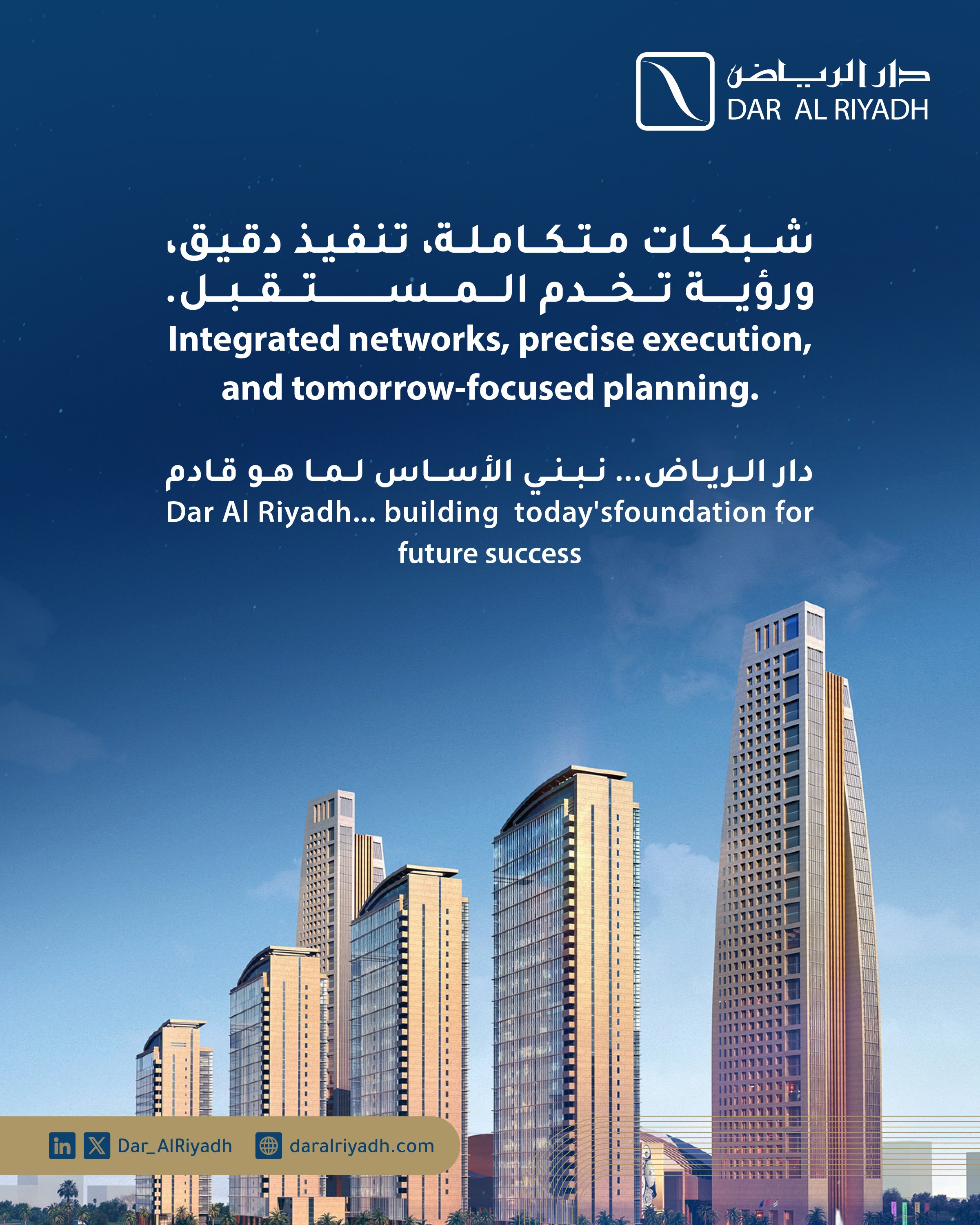
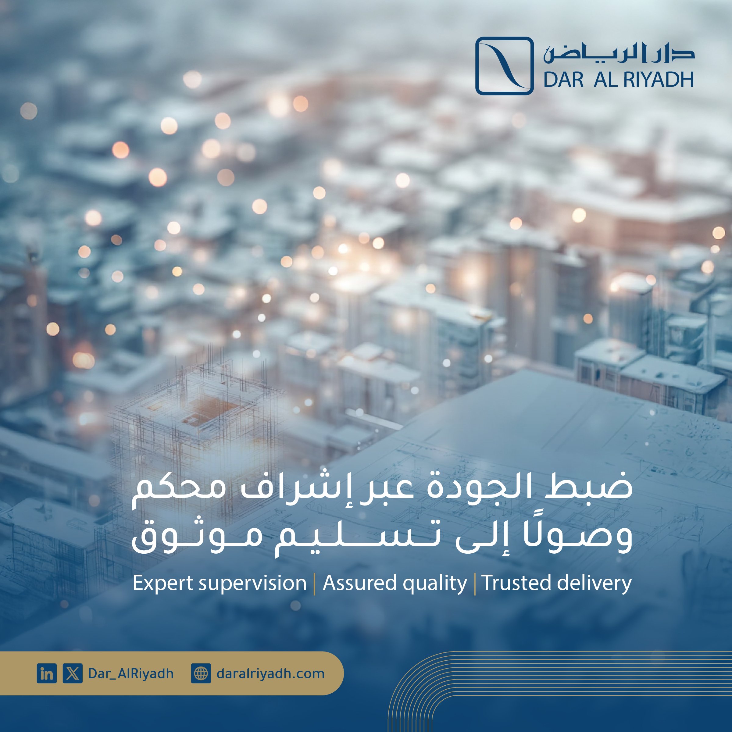
Dar Al Riyadh is a powerhouse of Saudi engineering with a 50-year legacy. In partnership with JWC, I lead the visual direction for their digital presence, transforming a fragmented social media approach into a structured, authority-driven design system. My role focuses on bridging the gap between their historic corporate prestige and modern digital communication standards.
01 | Initial Assessment
Upon joining the project, an audit of the brand assets revealed a common corporate gap: the existing brand manual was designed for a print-only era.
It provided no governance for digital environments. Decisions were being made subjectively, leading to a visual "drift" that diluted the firm's professional authority.
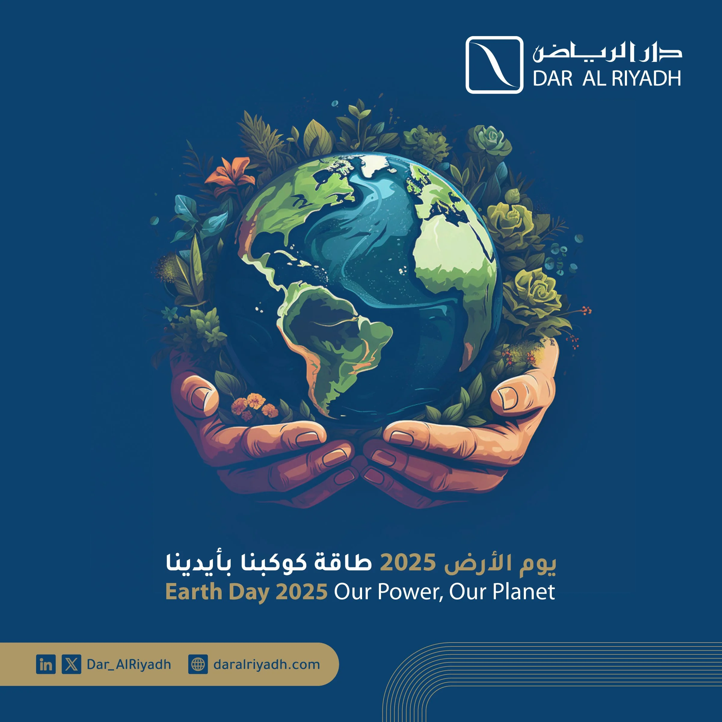
02 | Strategic Objectives
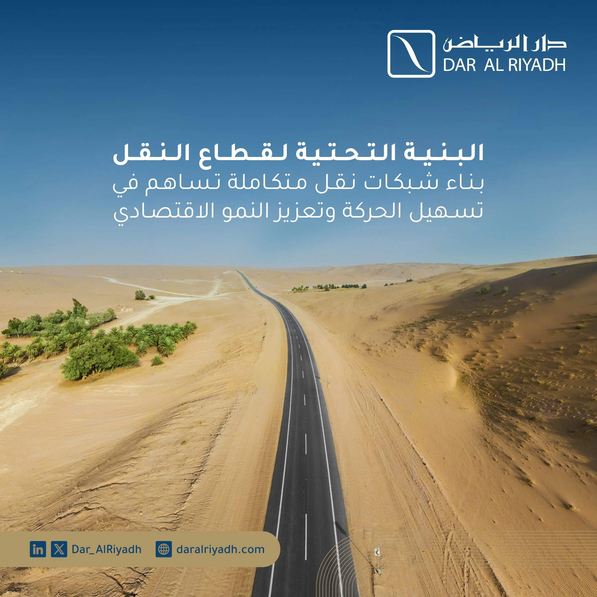
Architecting a scalable digital design system.
Expanding the brand manual for high-stakes digital environments.
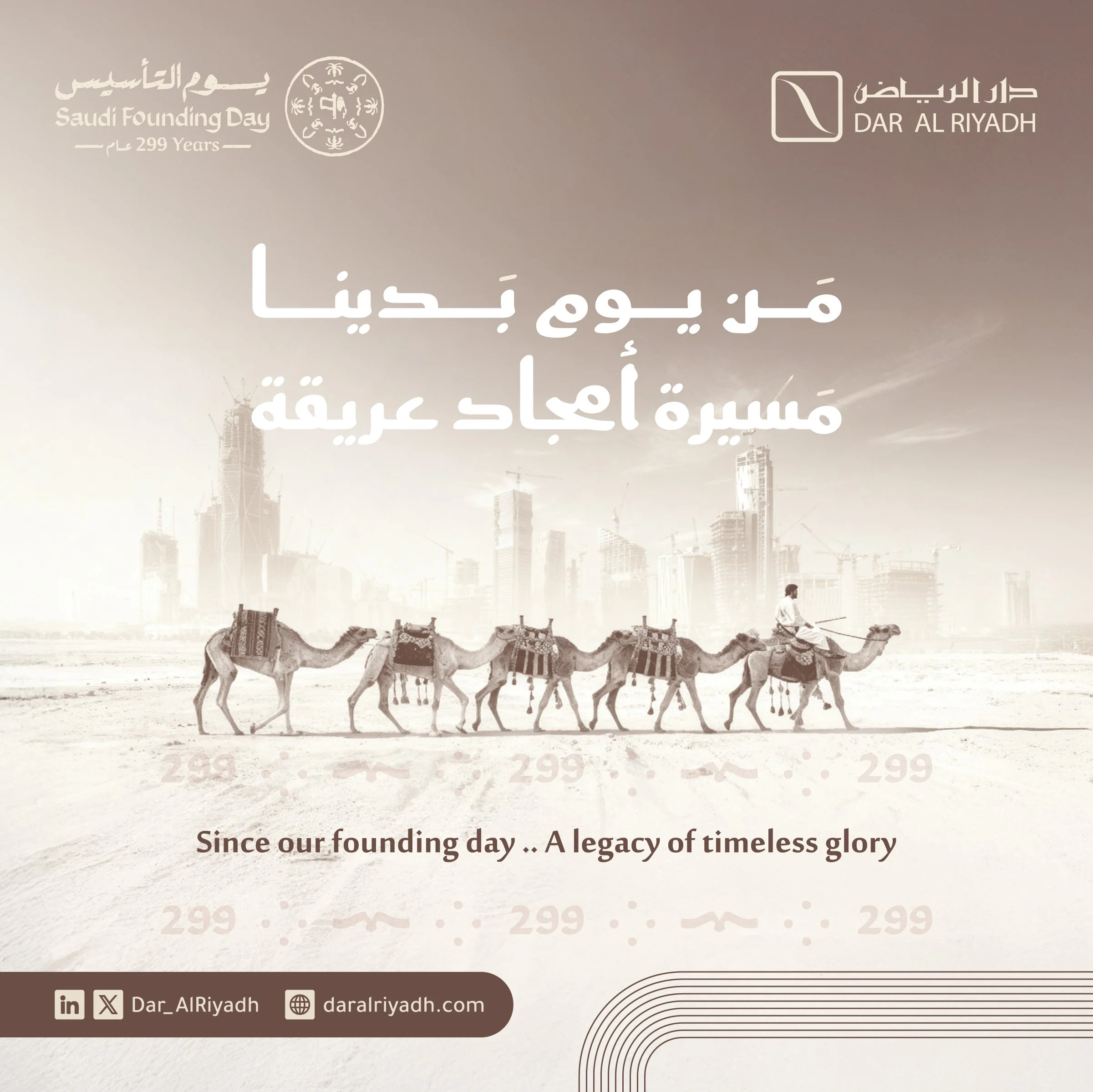
Solving the bilingual hierarchy (Arabic/English) for text-heavy content.
Replacing inconsistent layouts with a unified visual signature.
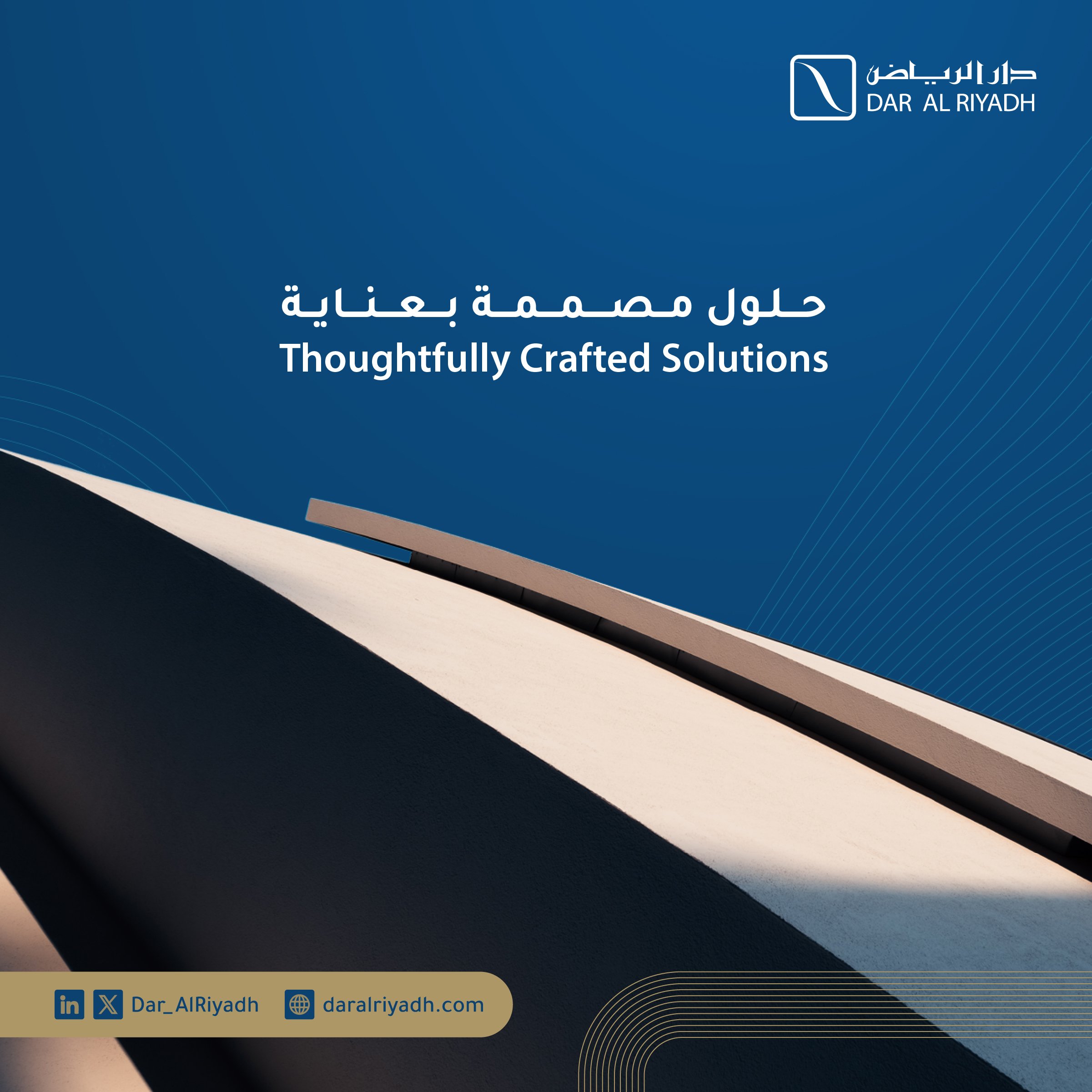
03 | Design Strategy
Instead of a surface-level redesign, I built a flexible framework that allows for rapid content production without sacrificing brand integrity.
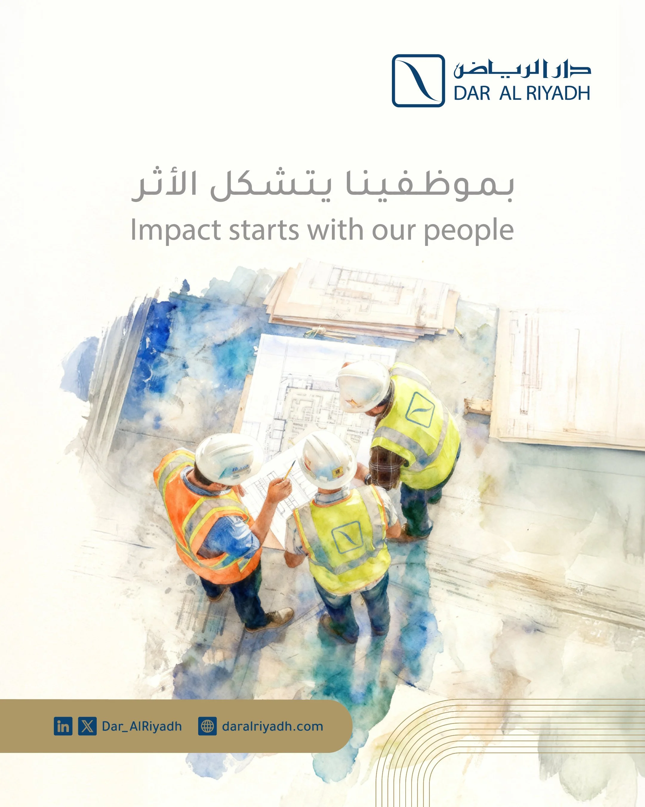
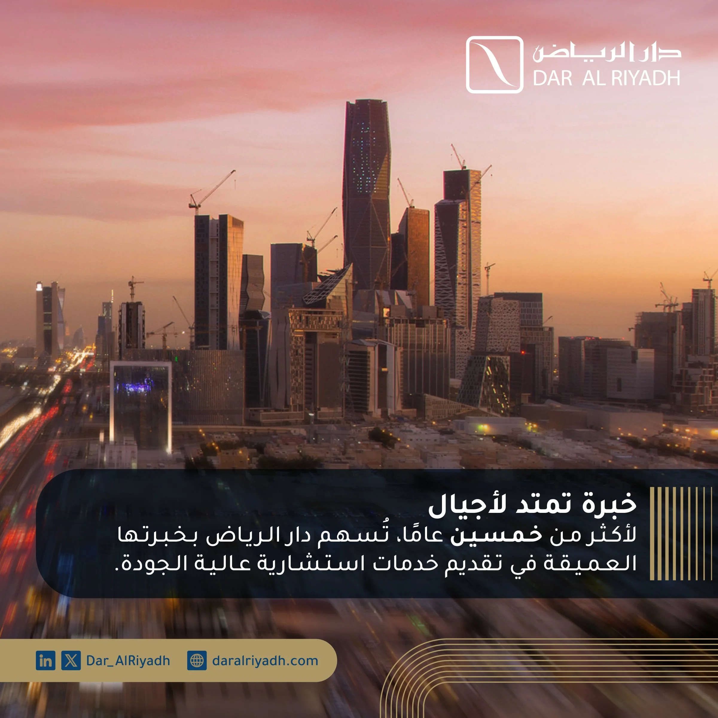
By introducing a modular grid-based layout, we created a "system of truth" that ensures every post—regardless of the topic—is instantly recognizable as Dar Al Riyadh.
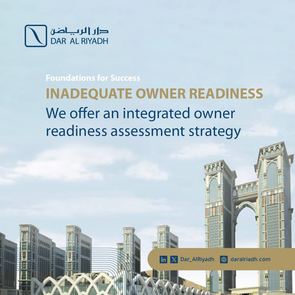
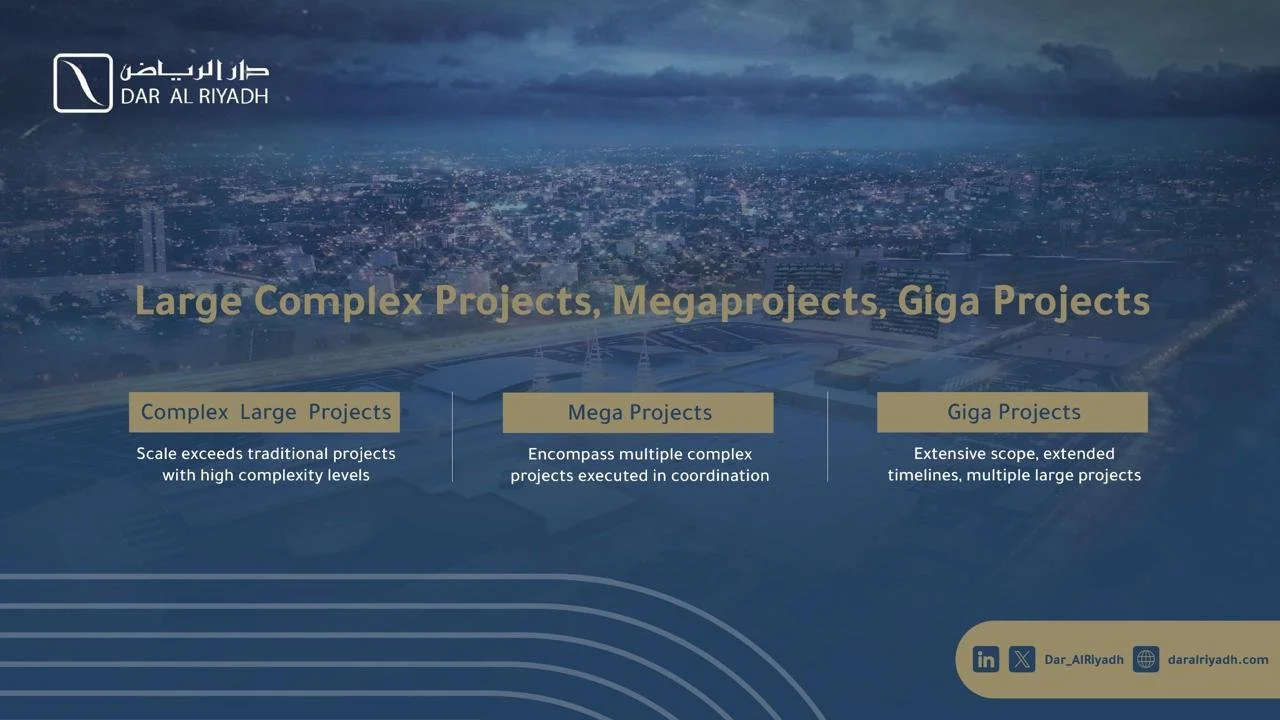
04 | System Development
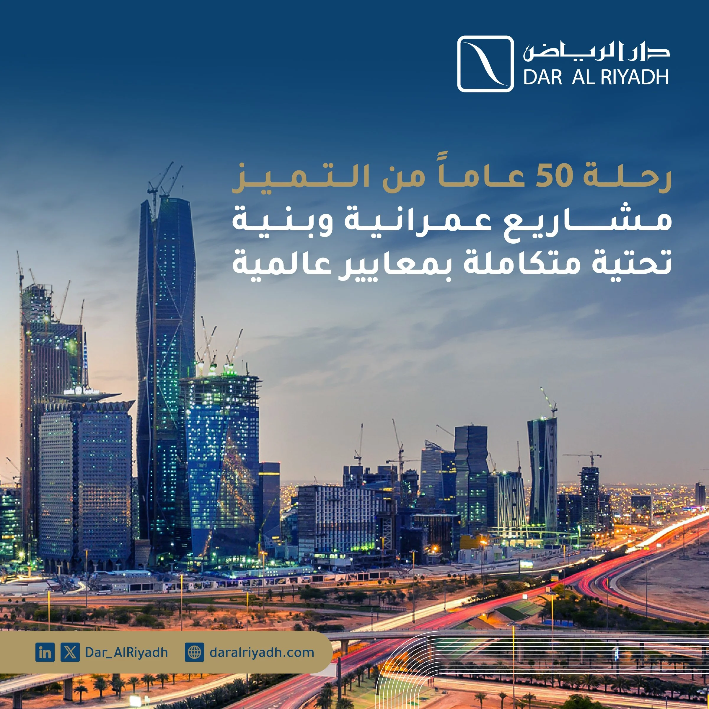
I standardized the brand across three primary digital formats (1:1, 750×1200, and 1080×1350). This was not just about size; it was about Information Architecture.
These formats were engineered to balance high-density engineering data with clean, modern aesthetics, significantly improving cross-platform readability and engagement.
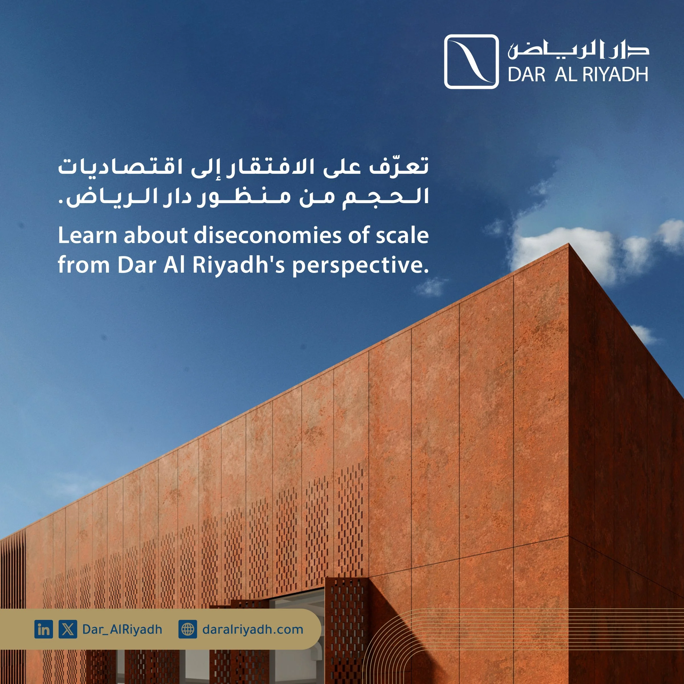
05 | The Bilingual Challenge
Managing bilingual typography in a single frame is a technical challenge. I developed a dual-axis visual hierarchy that gives equal weight to Arabic and English while maintaining a clean, "breathable" layout.
This ensures the brand communicates effectively with both local stakeholders and global partners.
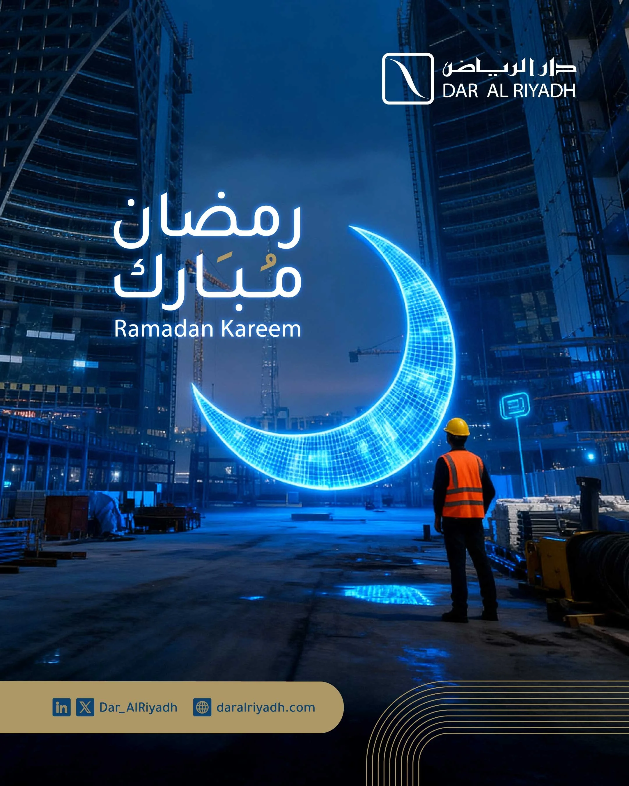
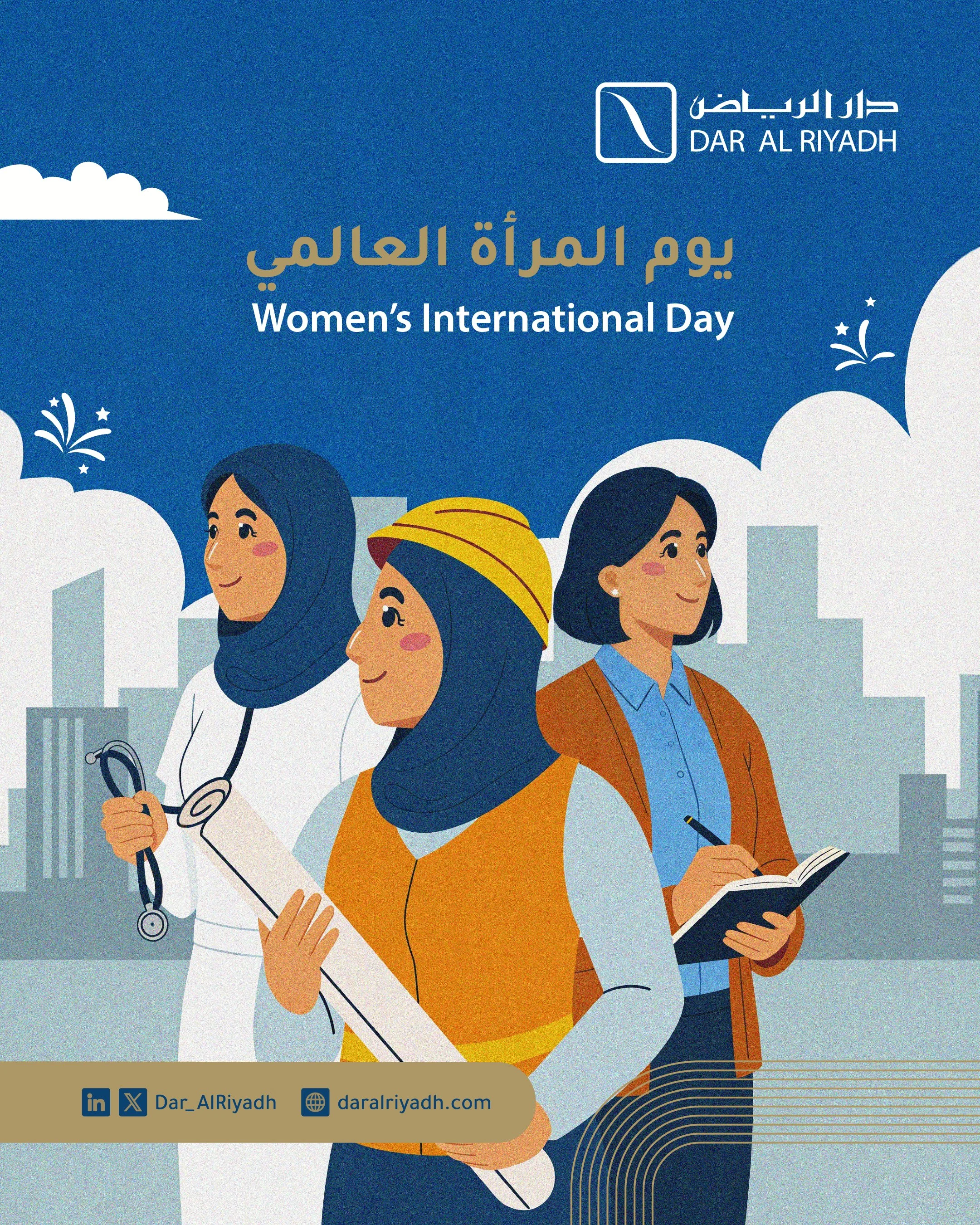
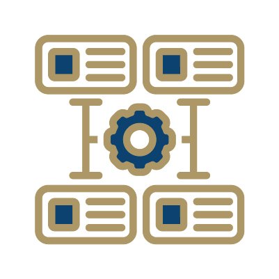
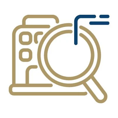
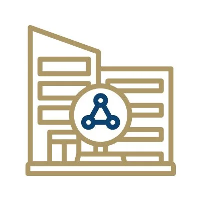
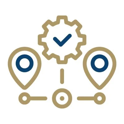
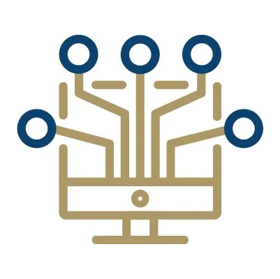
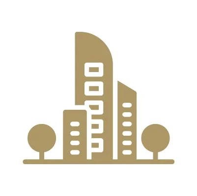
06 | Visual Language & Iconography
To simplify complex engineering concepts, I developed a custom iconography system that wasn't previously defined in the brand manual.
This visual shorthand creates a "pattern of recognition," allowing the audience to categorize content (AI, Infrastructure, Architecture) at a glance.


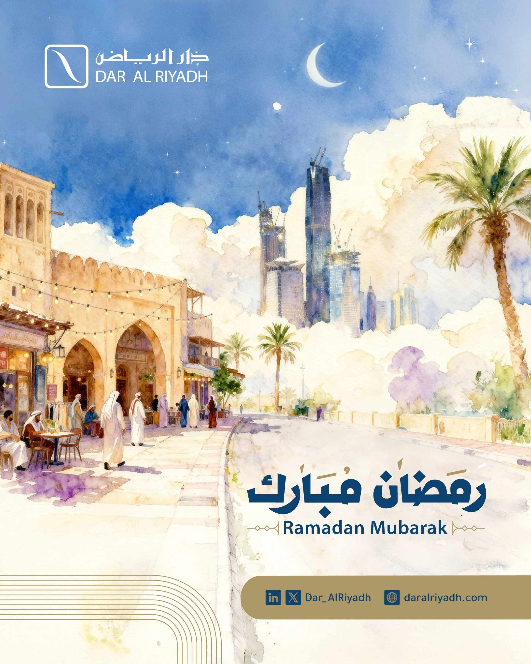
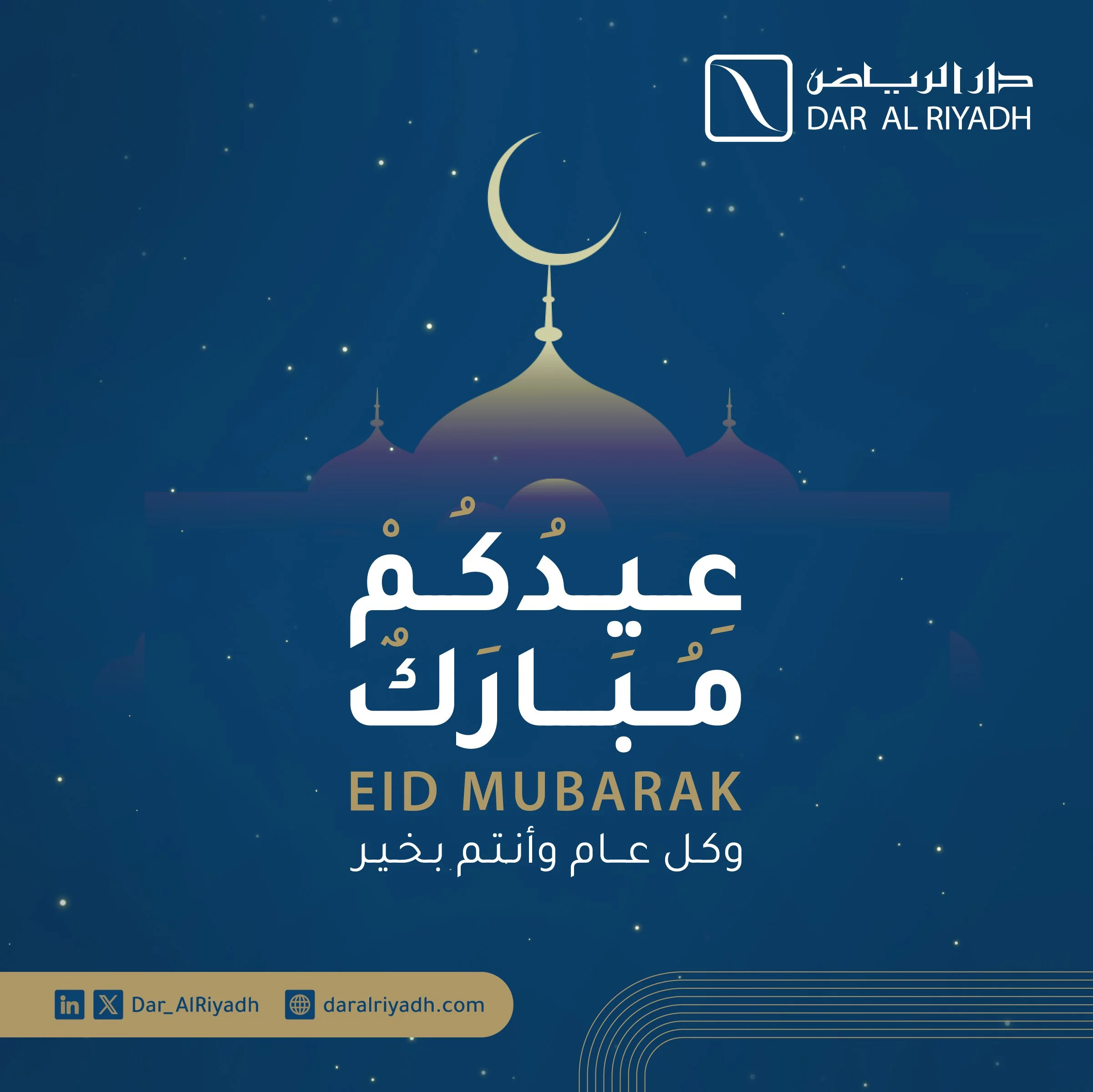
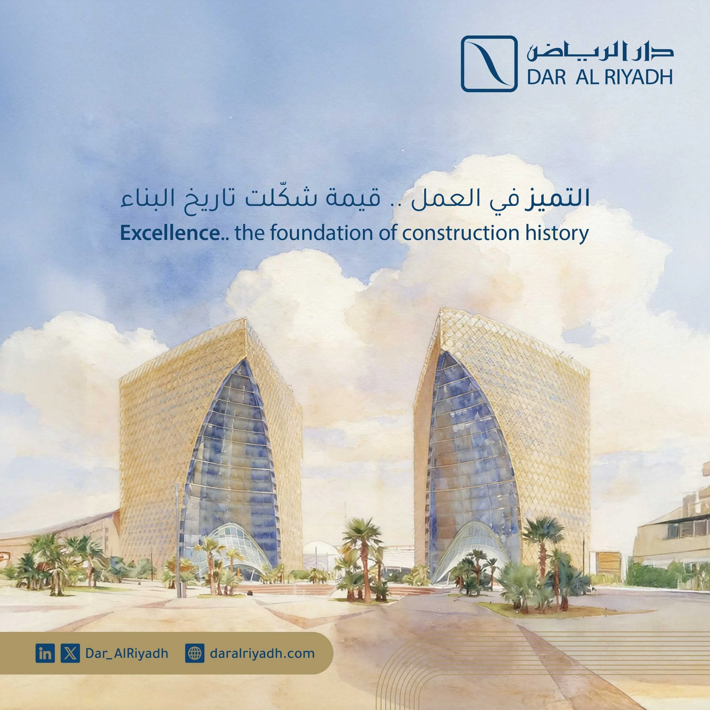
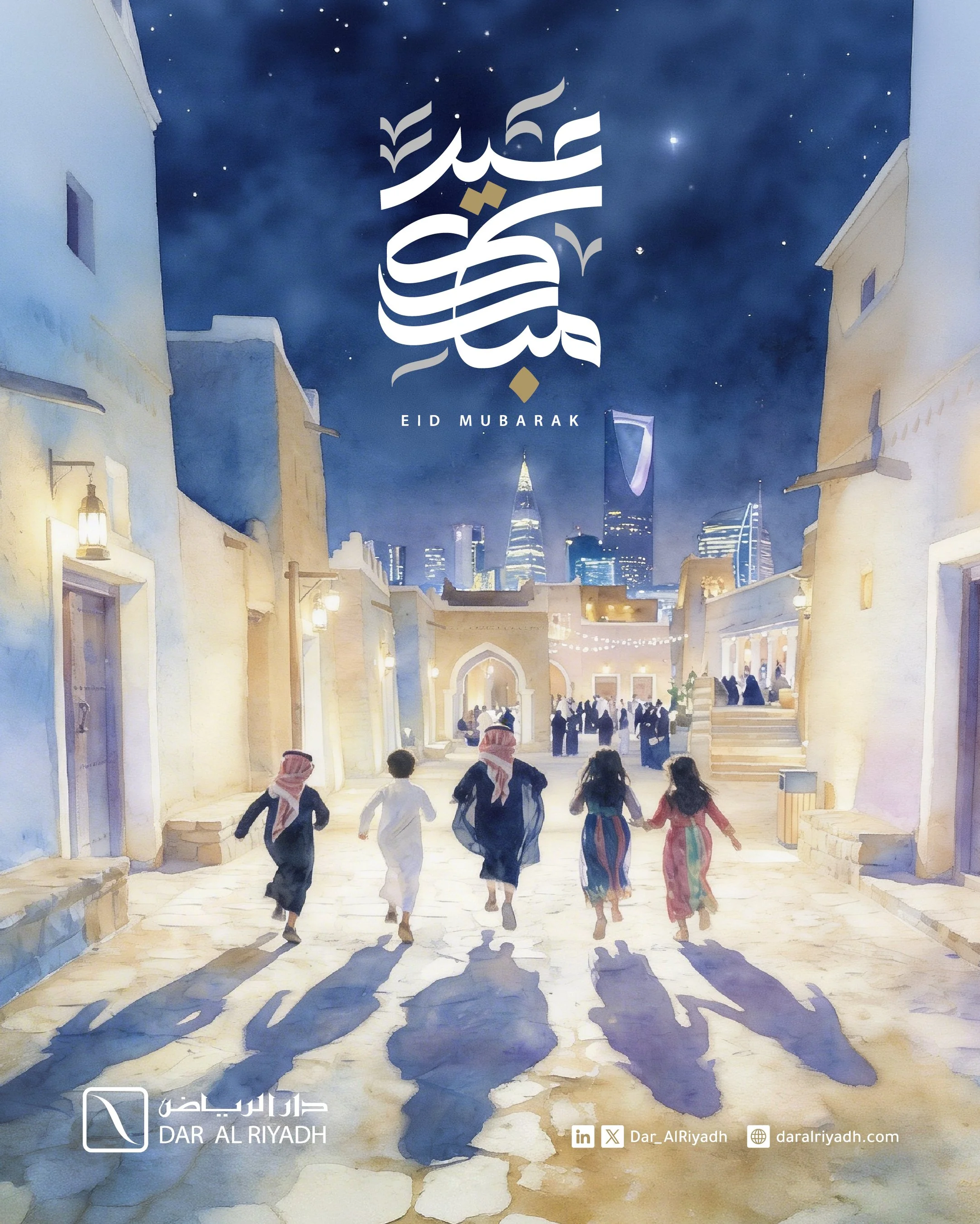
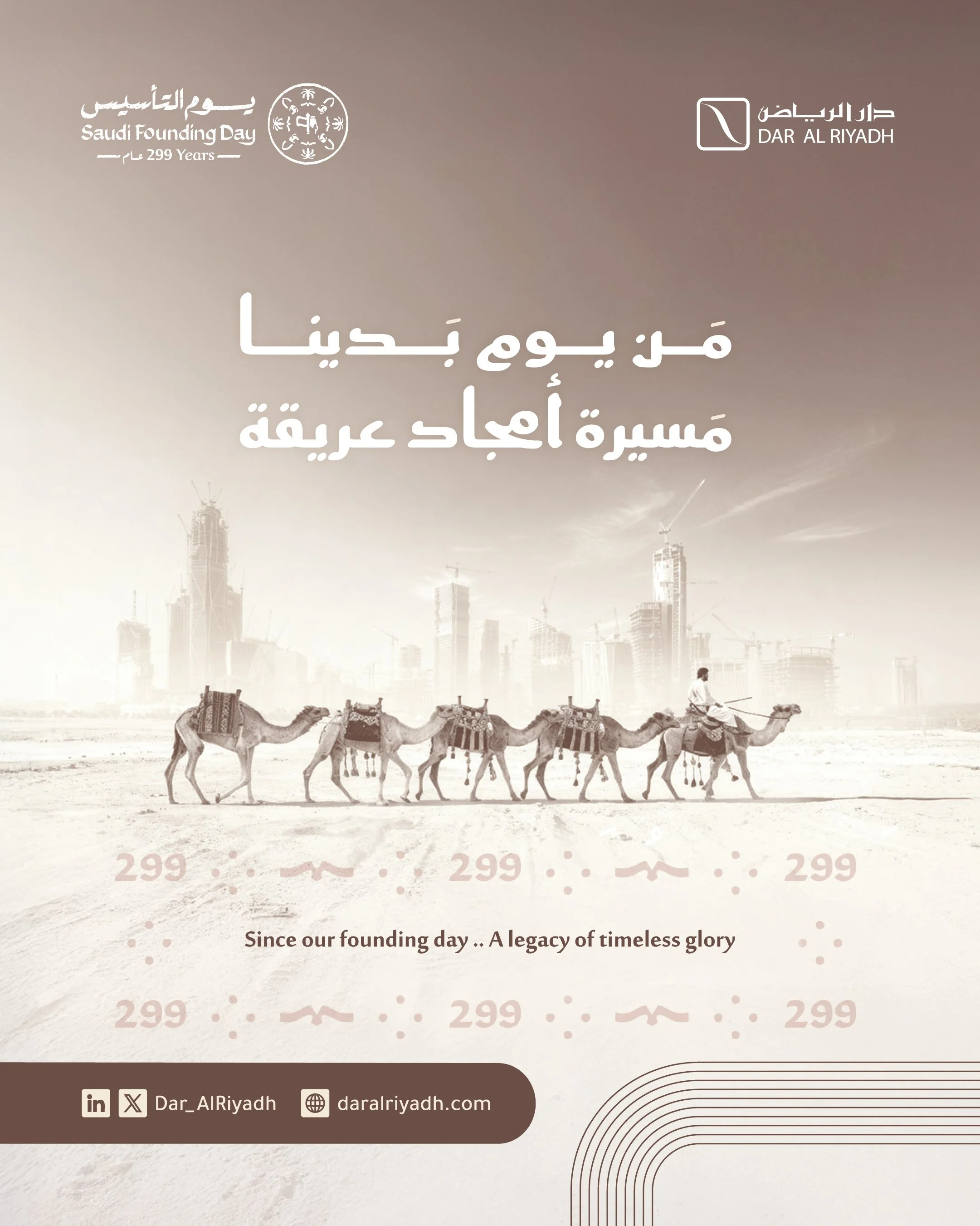
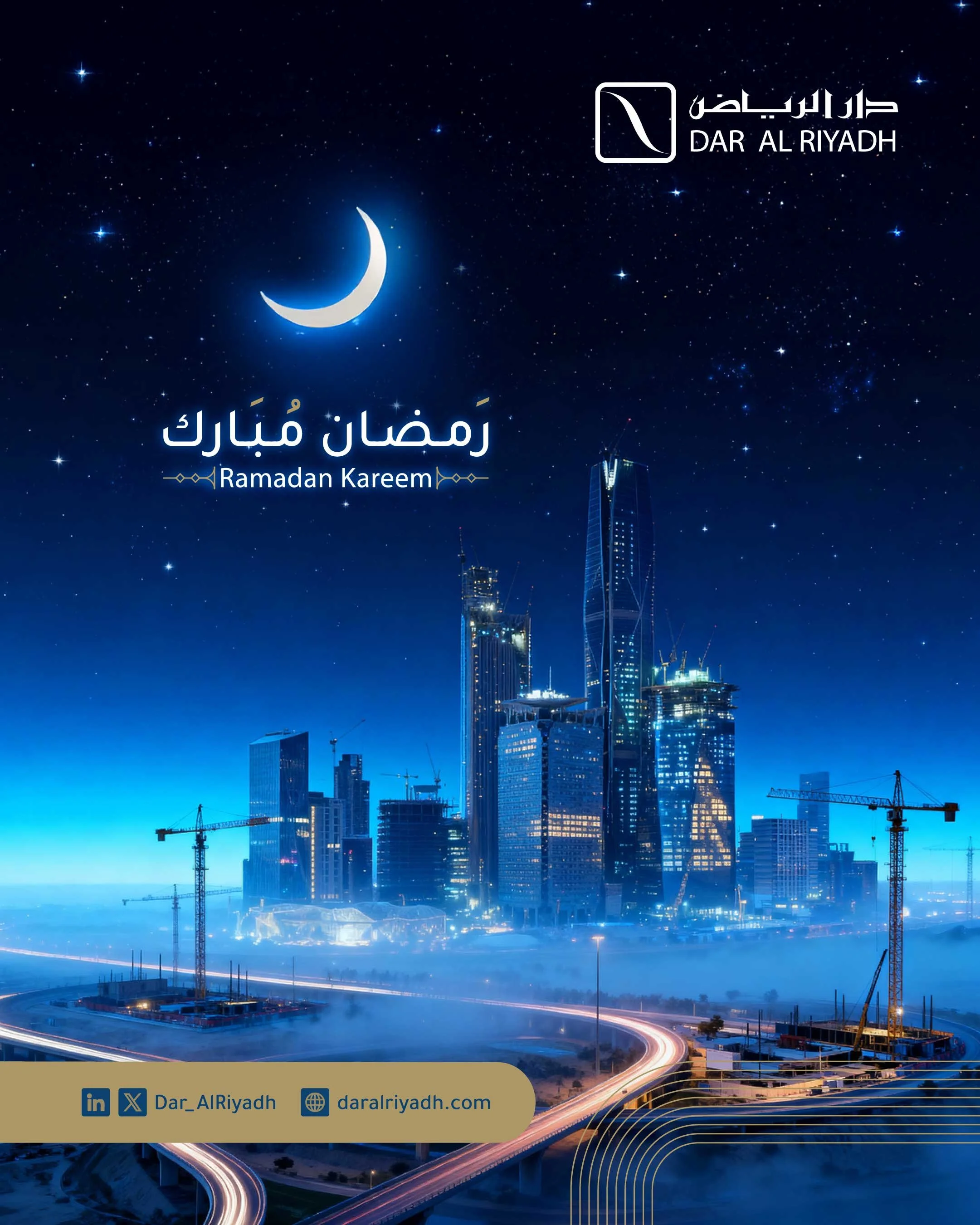
For the Ramadan season, the strategy shifted from "Corporate Authority" to "Cultural Connection."
I introduced a softer, watercolor-inspired art direction that maintained professional standards while adding a layer of warmth. This demonstrated the brand's ability to be human and culturally resonant without losing its structural foundation.
Ramadan Campaign
(The "Human" Extension)